< Prev Top Next >
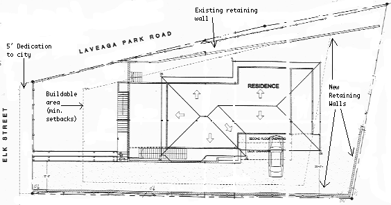
North

The dotted line on the left is a ``5' dedication to the city''. I find this odd, because around here one is usually forced to give the city an ``easement.'' Basically, you lose all rights to the property in question, but maintain full liabilities -- taxes are assessed, and if someone is hurt, your insurance is charges. This, however, is a dedication. It has its own APN and the owner of record is the man from whom we purchased the lot.
The dotted line in the middle is the buildable area. We are allowed to build anywhere within this line without any special variances. Notice how the house touches this line at the south-east corner, and almost touches it at the north-west corner.
For some sense of scale, the buildable area starts 20' from the front (Elk St.) side of the lot.
You can also see the retaining walls that we had to build. The longest (at the bottom) is about 130' & ranges from 2' to 5 1/2' above the existing grade. The one to the east is about 30' long and ranges from 3' to 5 1/2' tall. These two were required because we had to raise the south-east corner of the lot 5 1/2' so it would drain to the south-west.
Finally, the one to the North is about 40' long at a constant 4' height. This area used to be held up by some railroad ties & we thought we'd do something a bit more permanent.
Here are a few notes about the revisions. I have all of them on the computer, so it's easy to go back & see where we've been.
So, without too much work we removed 656 ft.2. This could have been much worse! If I remember correctly, we also brought some of the walls in a foot or two. All in all, not a bad compromise. I think it would have been nice to have the children's room a bit larger though. In our current house, they are sharing a single, 110 ft.2, so the new rooms are bigger and aren't shared. The architect also took great pains to make sure each was exactly the same size.
A quick note about the plan: at the beginning we purchased 3-D Home Architect by The Learning Company. We purchased a few others also, and this is by far the easiest to use. The layouts below are my version, taken directly from the house plans that we're using. Unfortunately, there is no way to export pictures out of this program, so I had to print them, scan them, and edit them. So if they look odd, you'll know why. Both upstairs and downstairs are the same scale.
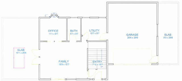
The house is two story, Mediterranean style. The ceilings are 10' except in the garage where they are closer to 11'. The garage had to be lowered due to the way our driveway comes in. Some notable things about this:
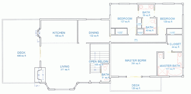
The living room & kitchen are one big space. This is pretty standard now from what we've read in the magazines & seen on ``This Old House'' and ``Hometime.'' There's an island in the kitchen (not shown). We wanted a formal dining room, so there it is off to the side. There's also a pass-through into the kitchen (again, not shown) so we won't be spending a lot of time wandering around that wall.
The Jack & Jill bathroom for the kids was a must. Our kids are 23 months apart, which makes them one school-year apart. Hopefully they won't fight over the shower in the morning if they each have their own sink. Originally there was a wall between the sinks, and two entries into the lavatory/shower area but this proved too difficult. Instead of wasting the space, we made the bedrooms a bit bigger. There are pocket doors separating the bedrooms from the sink area. They're drawn in yellow which makes them difficult to see.
For our room we wanted something a bit bigger than we have now. The walk-in closet was a must for Lynn. An extra large bathtub a must for me. I'm 6'4'', and Lynn is 5'8'' and neither of us has ever fit into a bathtub. Now we do.
Actually, the master bedroom could have been smaller, we just couldn't determine a better way to use the space. When Lynn runs out of closet space, we can put wardrobes on the walls to either side of the bedroom. That's why the windows don't go all the way to the walls.
I just noticed there's no door into the master bedroom. This was a transcription error on my part (just like the kitchen island). Hopefully Derek reads the real plans & doesn't use the ones posted here. The door is directly opposite the one on the right-hand bedroom.
The living room, kitchen, dining room, and stairway have 12' ceilings, the bedrooms have 10'
The master bedroom overlooks the ocean (OK, it's two miles away but it's there). Yes, in Santa Cruz the ocean is almost due south. We're located on the north side of the Monterey Bay. When the framing is done, I'll try to get some pictures of the view. The children's rooms look at the trunks of some really tall Blue Gum Eucalyptus trees.
I must say that I don't think pocket doors are used nearly enough. People are willing to give up 9 1/2 ft.2 which is the swing radius of a standard door. I think pocket doors are great because you give up no space! We've seven in this house.
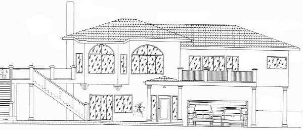
This is the artist's rendition (OK, AutoCADs rendition) of the front of the house, as seen from the south looking north.
< Prev Top Next >